
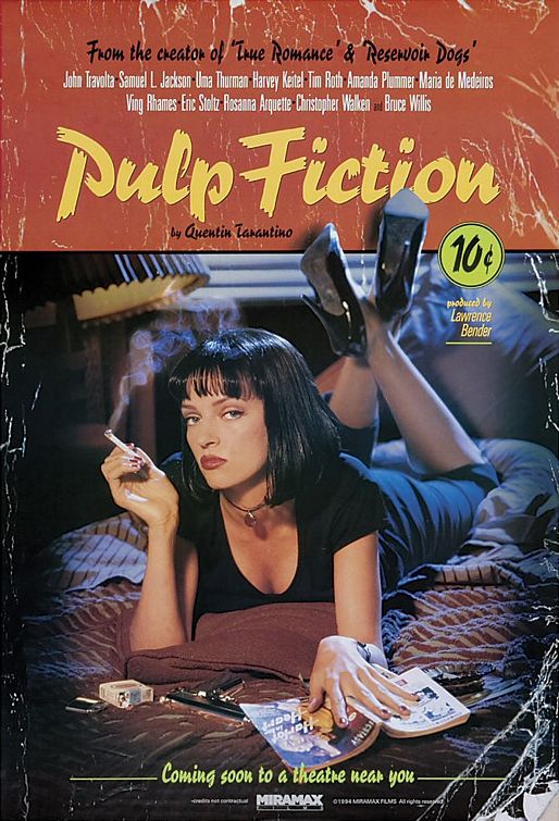
The first thing to note about the poster is the general 'trashy' look that it holds. If you look at the edges and corners they appear torn and worn down indicating it's not so much a poster, but more of a book whereby a collection of stories are written. The wear and tear look of it indicates many read throughs and is similar in style to the one that Uma has in front of her. Reinforcing the 'book look' is the 10 cents sign at the top of the poster where it could be a reflection of said stories being cheap and sleazy.
The image of Uma Thurman in the middle is for both appeal and an indicator of genre. The pose that she holds seems to suggest her troublesome nature with a cigarette in one hand, a book in the other, and her legs crossed. Backing this up is the gun in front of her indicating that she could possible be a trouble stirrer within the story. For the males, this pose lures them in and influences them perhaps to watch the film. This is done through her body language, troublesome nature, and her feet which aren't part of the image, but come out from it to create the effect of drawing the viewer in.
Along the top of the poster features the names of many famous actors. Interestingly enough these names are in clearer view than the Director's name himself. This was at a time when Quentin Tarantino was little known whereas the actors were, so it would have been considerably more important to have their names as a Unique Selling Point. Beneath their names is the title, 'Pulp Fiction' written in quite an old-style font, again contributing to the style of the poster.
-Dale
No comments:
Post a Comment